Financial Calculator - Research
Overview
Purpose and goal: The UX research team was assigned the task of evaluating a preexisting banking calculator used by financial professionals. The goal was to find usability and UI weaknesses that would be addressed in the upcoming redesign.
Role: I was one of 3 researchers. The team included the UX Lead, a co-op student and myself.
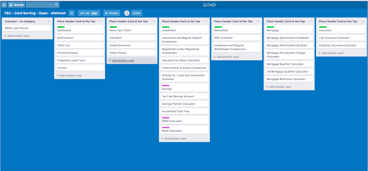
Methods: This was an extensive and thorough research project. The methods we utilised included: initial interviews, personas, user journey maps, competitor analysis, usability tests, heuristic evaluation, and open card sorting.
User Interviews
From the initial interviews, we were able to develop 2 personas and establish each persona’s user journey, defining their goals and identifying pain points. For example, we learned that the financial advisors needed to calculate the data for mortgages quickly and accurately to retain potential customers who might be shopping around with other institutions.
This information was used to inform the design of the usability test tasks.
Competitor Analysis and Evaluation
The research into the financial calculator included a competitor analysis, a heuristic evaluation and several card sorting sessions.
For the competitor analysis, we conducted online research, reviewing the features of 5 banking calculators. The results table easily identified the strengths and weaknesses of the financial calculator in comparison to major Canadian banks and financial sites.
For example, the financial calculator was missing helpful usability features such as allowing the user to fill-in unknown data such as interest rates and property taxes or the ability to use real-time rates to perform mortgage calculations.
The heuristic evaluation uncovered a lack of basic accessibility features, such as keyboard tabbing capabilities. There were also unclear and uninformative error messages.
“Oops! 5011 numOfYears years of payment <0”
Usability Tests
In-person usability tests were conducted with 7 participants, 1 facilitator and 2 notetakers/observers.
Each participant was asked to complete 11 tasks and to rate each task for ease of use on a scale of 1 to 5.
They were also asked to complete a System Usability Score test at the end of their session.
Insights and Analysis
Insights:
The usability tests pointed out serious navigational and usability issues with low completion scores for 5 out of 11 of the tasks. The calculator also received a fairly low SUS score of 52% from the participants.
When participants were asked to retrieve a previously started mortgage calculation there was a 0% completion rate.
Users mentioned that they were not able to understand some of the calculations, especially for the TFSA savings calculator.
“What does that mean?”Over half of the users could not successfully create an account, rating the task a 3.33/5.
Analysis & Report:
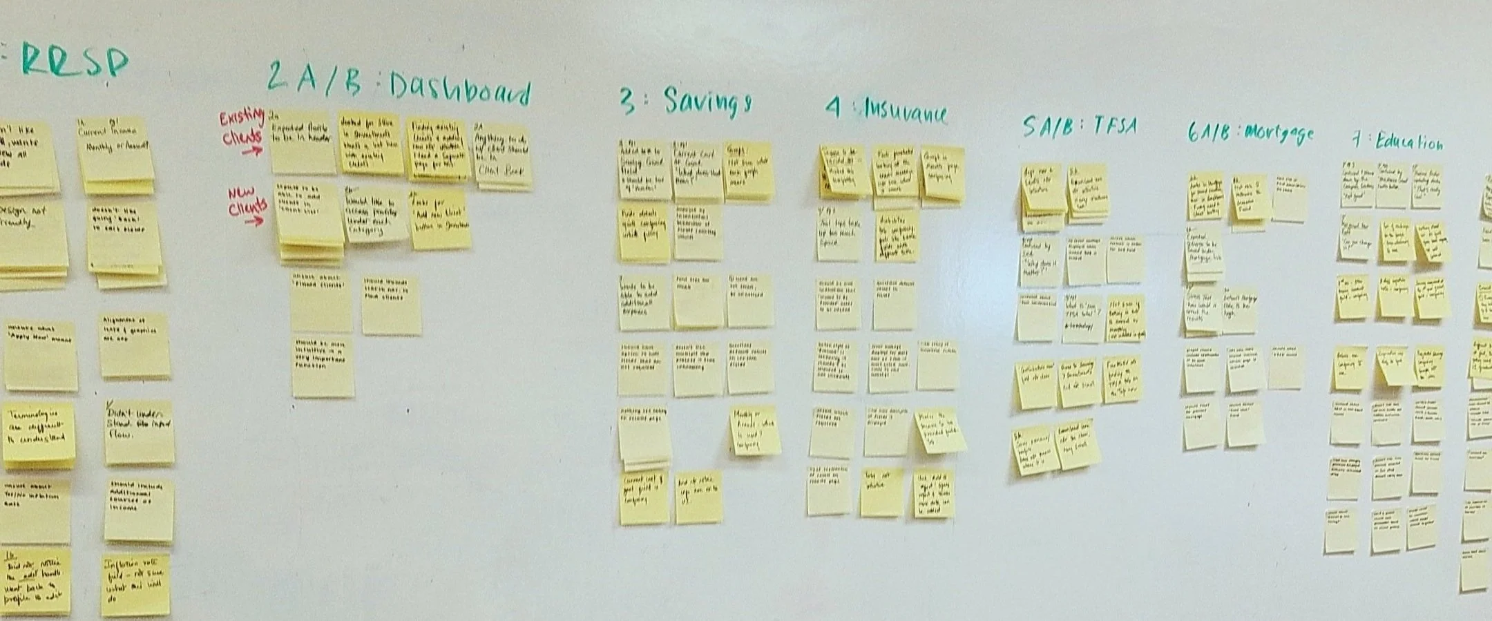
After completing the usability tests, we used sticky notes and a whiteboard to create an affinity map, to find and establish themes. We first organized each column by question, then grouped the notes with similar points. These new groups were then subdivided by positive and negative observations and remarks.
A formal report with all of the previously mentioned research was created and presented to the stakeholders by myself and the UX Lead.
The report convinced the product owner to take a new approach, opting for a complete redesign rather than tweaking the current product.


